
Discover Your Seasonal Colour Personality to Help Decorate Your Home Using a Short Quiz
Carole Jackson’s groundbreaking colour theory became a sensation in the 1980s thanks to her bestselling book Color Me Beautiful. Her idea is that we all fall into one of four seasonal colour groups: Spring, Summer, Autumn or Winter, each with its own palette of hues that reflect and support our personality, mood and energy.
While this concept is most often used in fashion, it absolutely applies to interior design too. The idea is that certain color palettes naturally resonate with us, making us feel uplifted, calm, or energized depending on our unique personality. Whether or not we’re aware of it, we all react emotionally to different colours. It’s more than what we see, its how we feel.
By learning what seasonal color personality we identify with (sometimes a blend of two), we can choose colours that reflect who we are and how we want to feel in our spaces. It helps eliminate guesswork, boosts confidence when styling and prevents costly décor mistakes.
Let’s explore the four seasonal color personalities and how they show up in your home:
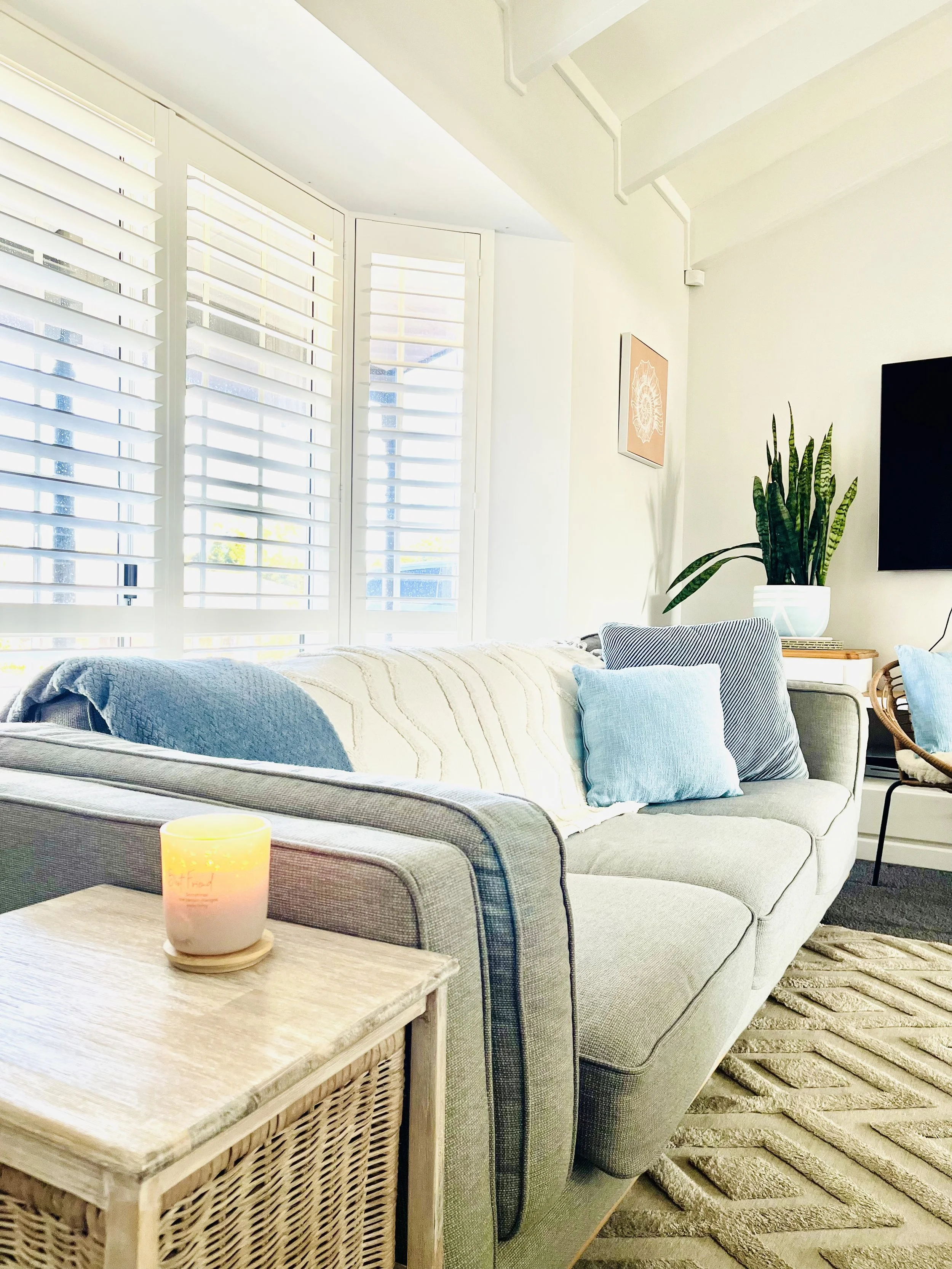
Summer Personality
Palette: Cool, soft, and faded tones
Colors: Soft blue, dusty rose, sage, light grey, lavender
Interior Feel: Calm, peaceful, elegant and romantic think breezy coastal vibes and slow living. Summer palettes work beautifully in bedrooms, bathrooms and living rooms when layered with textured linens.
Autumn Personality
Palette: Warm, earthy, rich tones
Colors: Olive green, terracotta, burnt orange, mustard, golden yellow
Interior Feel: Cozy, grounded, and inviting like curling up with a book on a rainy day. Perfect for creating cozy living rooms with natural textures and warmth such as wool, rattan and warm lighting.

Winter Personality
Palette: Cool, bold, and striking
Colors: Crisp white, cobalt blue, charcoal, emerald green
Interior Feel: Clean, modern, and dramatic. Winter palettes are great for focused spaces like home offices or formal dining rooms where contrast and clarity energize the mind. Lots of luxe materials are used like glass or velvet and the spaces are uncluttered.
Spring Personality
Palette: Warm, clear and light
Colors: Sky blue, bright pink, sunshine yellow, mint green, ivory
Interior Feel: Uplifting, joyful, and full of life. Spring palettes thrive in kitchens, kids' rooms, office spaces. Think open layouts, natural light, mirrors, floral cushions and ceramics.

Blending & Flexibility
There’s no one size fits all when it comes to colour personality. Most of us are a natural blend of two seasons or even shift with the time of year. As you may have noticed in the images throughout this post, the Summer and Spring personalities reflect my own home. I don’t currently have anything that fully represents Autumn or Winter in my space, but that doesn’t mean I wouldn’t embrace them from time to time.
Decorating your home should feel like a reflection of you, not a rigid set of rules. Feel free to refresh your space seasonally, perhaps with warmer tones and textures in winter and lighter, breezier touches in summer. Or simply mix and match elements from different seasonal personalities to create a home that brings you joy and supports your daily life.
The most important thing? Your home should feel good to live in not just look good from the outside.
What is Your Seasonal Colour Personality?
Take this quick 4 question quiz below to uncover which seasonal palette best suits your personal style and aesthetic preferences. Simply write down your letter choices and tally up which letters you chose most. Remember, you can be a blend of 2 seasons.
1. What mood do you wish to create in your space?
a) Energising, light and fresh.
b) Cozy, inviting and warm.
c) Calm, cool and serene.
d) Dramatic, bold and striking.
2. What natural setting are you mostly drawn to?
a) A spring garden in bloom.
b) An autumn forest trail.
c) The seaside on a crisp morning.
d) A moody mountain escape.
3. Choose your ideal texture in your home.
a) Linen and floral prints.
b) Woven baksets and knits.
c) Rattan and smooth ceramics.
d) Dark woods and velvets.
4. What are your go to colour palettes?
a) Soft pastels, blush pinks, lilacs and mint.
b) Earth tones such as mustard yellows, terracotta and olive.
c) Cool neutral tones like powder blue, seafoam and taupe.
d) Rich tones like forest green, navy and charcoal.
Results:
Mostly A’s - Spring personality. You enjoy freshness, light and airy vibes that are uplifting and have pastels and floral tones.
Mostly B’s - Autumn personality. You love grounded, warm and earthy hues that make you feel cozy and comfortable in your home.
Mostly C’s - Summer personality. You crave peace and serenity vibes with cool and desaturated colours.
Mostly D’s - Winter personality. You have a lot of bold elements that are sophisticated and elegant with deep, dramatic tones.
Final Thoughts…
If you take one thing away from this, let it be this: color isn’t just decoration, it’s deeply personal. Surround yourself with hues that feel right to you, support your emotional needs, and reflect your personality. That’s where the true beauty of interior design lies.